
This week I was tasked with making an infographic. Before starting I wondered to myself what makes an effective infographic and how can I make it informational and visually appealing. To answer these questions, I analyzed two infographics to see what I found to be the best elements in graphics. Finding a balance of visual appeal and educating your reader can be hard but when you get it right graphics such as these can help inform people in a better way than an article.
Infographic #1
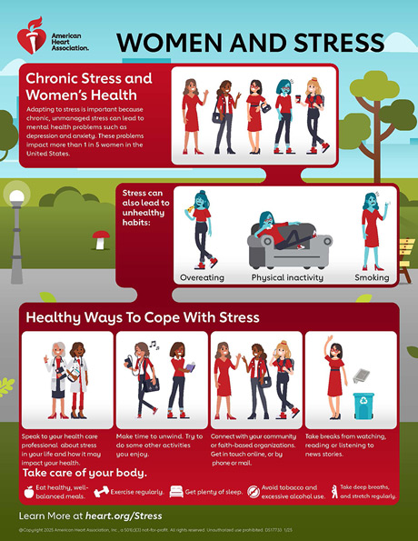
Graphic from Heart.org
This infographic is effective and conveys the importance of managing stress with a design that makes you want to read more.
This first stuck out to me because of the organization of information. The graphic starts out sharing what they are focusing, chronic stress and women’s health. Then it moves on to share why this can be bad followed by how you can better manage your stress.
The headings and photos help make it an easy graphic to skim and get the main points. The bright colors also help draw your eyes to what they are saying without taking away from the information. The font is simple and bolded when appropriate further helping the reading experience. There is a good balance between text and visuals, the photos help convey the message without taking away from the text.
Infographic #2

Graphic from pesi.com
The data in the first section of the infographic helps the reader better understand why it is important to manage your stress and how many people struggle with this. The powerful statistic that one in five women struggle with mental health made me want to keep reading to see what the recommendation is.
Overall, I think this is a good example of an infographic. It is clear and concise, gives the reader a call to action, and shares where you can find more information. I will incorporate the flow of information into my own work to clearly inform the readers on what the call to action is.
This second infographic takes a different approach to effectively communicating information. The design is fun with a number of graphics that help add to the text and help with readability. The color scheme is not too bright but takes advantage of the brighter colors for main points. Additionally, the hearts for the bullet point numbers make it more visually appealing.
The graphic doesn’t include hard data but instead shares why each of these tips are effective to boosting your mood with intentional eating choices. The website does say this graphic aims to educate on the impact food has on mental health. I do think data points would help strengthen this infographic but there is also enough text as is.
The font of this graphic combined with the different colors help draw the readers eyes to main points. I like that you can skim this for quick tips or read it more in depth if you want to learn more.
I think this infographic is a bit text heavy but there are things I would include in my own infographic. I like the colors chosen, the visuals and icons, and the layout of the text.
My key takeaways
There are many ways to make an effective infographic and analyzing what works for different graphics and readers is helping me improve my own design skills. In my own infographic, I plan to use a similar layout to the first infographic since I found it easy to skim and visually appealing. Additionally, the use of fun bullet points in the second graphic is something I want to incorporate to spice up the graphic, making it feel like a more fun read.
Next time you see an infographic think to yourself how is this effective? What would I use in my own infographic?
